Celebrating 35+ Years

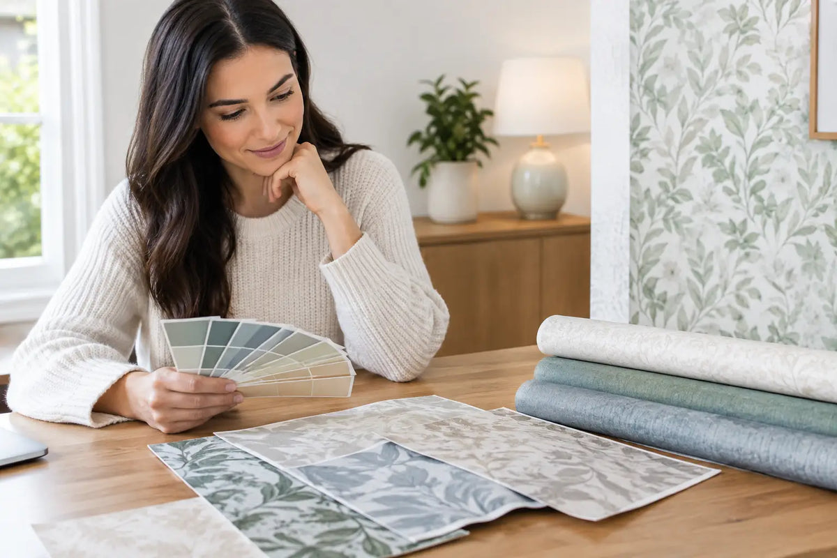
How to Pick Wallpaper Color Undertones at Home
A wallpaper can look like a soft neutral in the showroom, then read distinctly pink, green, or icy gray once it is on your wall. That shift is not your imagination. Learning how to pick wallpaper color undertones is what separates a paper that simply looks pretty from one that makes the entire room feel intentional.
The surface color is only the starting point. Cream, gray, beige, white, blue, and even black wallpapers all carry quieter color notes underneath. Those notes react to daylight, lamps, flooring, trim, fabric, and neighboring rooms. See them clearly before you order, and wallpaper becomes one of the easiest ways to create a polished, connected home.
Start With the Color You See Second
The main color is the one you notice immediately: a beige ground, blue botanical, or charcoal geometric. The undertone is the subtle cast that becomes more noticeable when you compare it with other finishes. A beige wallpaper may lean yellow, pink, green, or gray. A white can feel creamy, crisp blue-white, or softly gray. Gray may contain blue, violet, green, or brown.
A useful test is to place the wallpaper sample next to a sheet of clean white printer paper. The white paper removes some of the visual noise around the design and makes the hidden cast easier to spot. If the wallpaper suddenly appears rosy, it has a pink or red undertone. If it looks a little mossy beside the white, it likely leans green.
Do not expect every wallpaper to fit neatly into one color family. Multicolor prints, layered florals, grasscloth, and textured wallcoverings may carry several undertones at once. In those cases, identify the color that appears most often in the background or the color that visually connects the pattern from a few feet away.
Read the Room Before Choosing Wallpaper
A wallpaper sample never exists in isolation. The room’s fixed elements are the colors it needs to live with, especially flooring, cabinetry, countertops, tile, fireplace stone, and existing upholstery you plan to keep. These finishes do not have to match, but they should not fight.
Warm-toned oak floors, travertine, cream tile, and brass hardware usually feel more cohesive with wallpaper that has warm or earthy undertones. Think ivory, camel, mushroom, olive, tobacco, muted terracotta, or warm gray. A blue-gray paper can still work beautifully in this setting, but a strongly icy blue-gray may make warm floors look more orange by comparison.
Cooler rooms with blue-based white trim, gray tile, silver finishes, or deep charcoal accents often welcome cooler undertones. Soft blue, green-gray, lavender-gray, crisp white, and mineral-inspired neutrals can bring those elements together. The trade-off is warmth: a cool paper may feel calm and tailored, but it can become stark in a room with little natural light or minimal soft texture.
When a room mixes warm and cool elements, choose a wallpaper with a bridging undertone. A muted green, warm gray, taupe, or complex blue can often connect both sides better than a very pure neutral. These adaptable shades are especially useful in open floor plans, where the wallpaper is visible from more than one space.
Check Light at Every Hour
Lighting is where many wallpaper decisions go wrong. A sample viewed under bright showroom lighting or on a phone screen cannot tell you how it will behave in your home. Order a sample when possible, then move it around the room over at least a full day.
North-facing rooms tend to receive cooler, bluer daylight. Warm undertones can keep these spaces from feeling flat, while cool papers can create a serene, moody look if that is the goal. South-facing rooms receive stronger, warmer light and often handle cooler undertones well. A pale yellow-beige paper that looks welcoming in a north-facing room may appear much more golden in a sunny southern exposure.
East-facing rooms are brightest in the morning and can feel cooler later in the day. West-facing rooms tend to shift warmer as afternoon light arrives. This does not mean one orientation demands one color. It means the timing of your life matters. If you use the dining room mostly at night, test the sample under the actual chandelier and lamps that will light the space.
Hold the sample vertically on the wall, rather than flat on a table. Wallpaper catches light differently when installed, particularly grasscloth, cork, metallic finishes, flock, and embossed vinyl. Texture can deepen shadows, brighten raised areas, and make the undertone more pronounced.
Match Undertones, Not Exact Colors
A coordinated room rarely depends on matching every beige, blue, or white exactly. In fact, exact matching can make a space feel flat. The goal is to choose colors that share a temperature or have enough contrast to look deliberate.
For example, creamy trim pairs naturally with a wallpaper that has a warm ivory or putty ground. Pair that same trim with a sharp blue-white wallpaper, and the trim may suddenly look yellowed. That contrast can be striking in the right design, but it should be a choice, not an accident.
The same principle applies to furniture. A camel leather sofa is usually happier beside warm neutrals, earthy greens, muted reds, and rich navy than beside a pale gray with a strong lavender cast. Conversely, a cool charcoal sectional can look especially refined with mineral blues, silvery grays, or blue-green botanicals.
If you are working with a patterned wallpaper, pull colors from the print rather than focusing only on its background. A floral with a soft beige ground may contain a quiet slate-blue leaf or cinnamon stem that connects perfectly with your rug, drapery, or accent chair. Those secondary colors often provide the most useful design direction.
How to Pick Wallpaper Color Undertones for Each Room
Different rooms ask for different moods, and undertones help set them.
Living rooms and bedrooms
These spaces usually benefit from colors that feel comfortable across changing light. Warm whites, soft taupes, muted greens, dusty blues, and balanced grays are versatile choices. For a feature wall, a deeper color can add drama without making every surface feel enclosed. Look for an undertone that relates to your largest furniture piece, since that item carries the most visual weight.
Dining rooms and powder rooms
Smaller or more occasional spaces give you permission to be bolder. Deep green, inky blue, wine, black, and richly layered metallic wallpapers can feel inviting under evening lighting. Here, a strong undertone can be an advantage. A black paper with a warm brown base feels very different from one with a blue-black base, especially alongside brass or chrome fixtures.
Kitchens, laundry rooms, and hallways
These hardworking spaces often connect to several rooms, so consider the undertones visible from adjacent areas. A lively botanical, stripe, or small-scale geometric can bring personality without disrupting the home’s overall palette. For kitchens, compare samples directly against cabinet paint and countertops. Even a subtle pink-beige undertone can clash with a green-gray cabinet color when placed side by side.
Use Samples to Make the Final Call
Photos are excellent for discovering patterns, but samples are where confidence begins. Tape a generous sample near the trim, beside the flooring, and next to any finish you are keeping. Step back six to eight feet, then view it close up. You are checking both the overall mood and the color story inside the pattern.
If you are choosing between two similar papers, live with them for a few days. Look at them in daylight, with lamps on, and when the room is empty. Bring in a pillow, paint swatch, cabinet sample, or curtain panel if needed. The best option often becomes obvious once it is surrounded by your real materials.
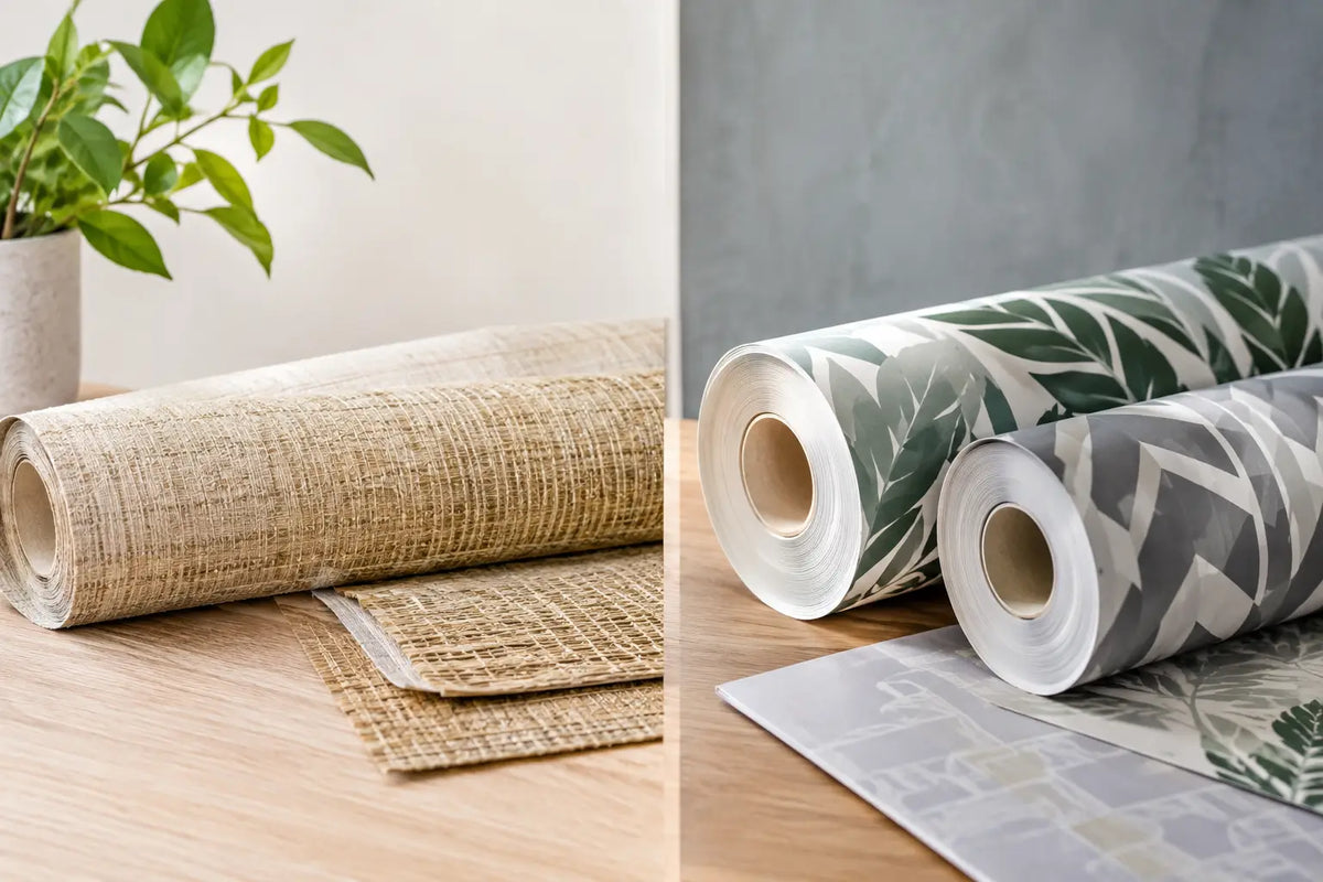
For shoppers who want to compare texture and color in person, Wallpaper and Stuff’s Smyrna showroom offers the advantage of seeing a broad range of in-stock papers together. It is especially helpful when you are deciding between a printed non-woven wallpaper and a natural grasscloth, since each reflects color and light in its own way.
Before you commit, give yourself one last practical check: picture the wallpaper beside the trim, floor, and main furniture at the same time. If the undertone makes those elements look richer and more connected, you have found a paper that will keep rewarding you long after installation day.