Celebrating 35+ Years

Best Wallpaper Patterns for Entryways That Welcome
The entryway gets only a few seconds to make an impression, yet it sets the tone for every room beyond it. The best wallpaper patterns for entryways make that moment feel intentional: warm without feeling busy, memorable without overwhelming a small footprint, and personal without clashing with the rest of the home. Whether your front hall is a generous foyer or a narrow pass-through, wallpaper gives it the finish that paint alone often cannot.
An entryway is also one of the few places where a little design drama can go a long way. It does not need to coordinate perfectly with every sofa fabric or bedding choice. It simply needs to create a confident transition from outdoors to in.
Best Wallpaper Patterns for Entryways
The right pattern depends on the architecture, light, and sightlines in your home. Still, a few pattern families consistently work beautifully at the front door because they create order, movement, or a welcoming point of view.
Stripes for height and structure
Stripes are a natural choice for entryways with low ceilings, traditional millwork, or a classic black-and-white palette. Vertical stripes visually lift the ceiling and make a compact hall feel taller. A narrow stripe reads refined and tailored, while broader bands make a stronger, more contemporary statement.
For a softer take, choose imperfect hand-drawn stripes or tonal stripes in shades that sit close together. Navy and cream, warm gray and ivory, or soft blue and sand offer definition without the hard contrast of a formal ticking stripe. In an open entryway, repeat one stripe color in a nearby rug, stair runner, or piece of art to make the transition feel considered.
Botanicals that bring a home to life
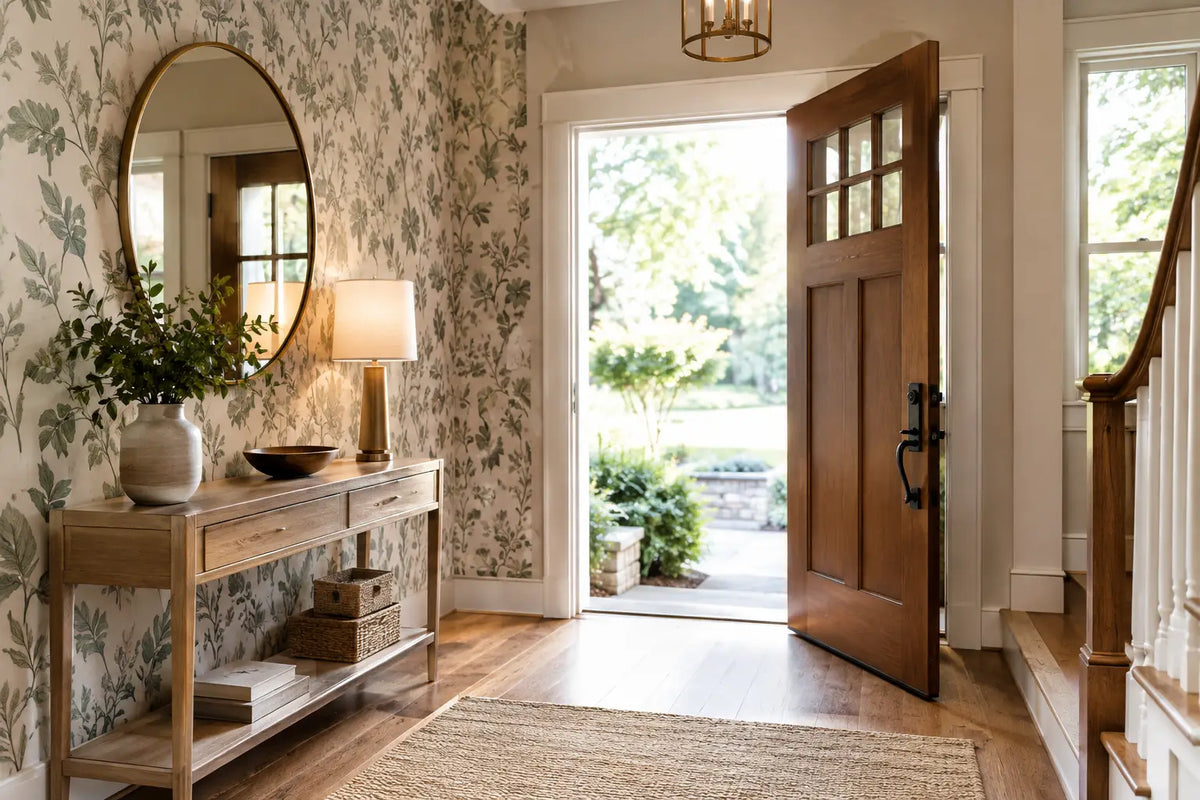
Botanical wallpaper is especially inviting in an entry because it introduces movement and color before guests reach the living spaces. Leafy vines, painterly branches, garden florals, and tropical palms can all work, but their scale matters. A small, tightly packed print is often suited to a narrow hall, while a large-scale botanical has more impact in a foyer with breathing room.
A botanical does not have to be bright. Muted olive, clay, charcoal, mushroom, and soft blue-green designs bring an organic layer to homes with neutral furnishings. If your entry has limited natural light, a pattern with a light ground can keep the space open while still delivering plenty of character.
Geometrics for a clean, updated welcome
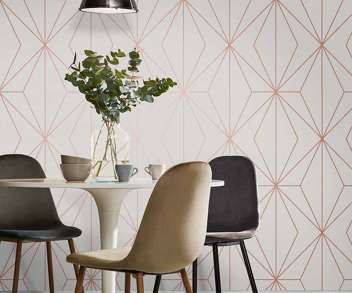
Geometric patterns bring rhythm to an entryway, particularly in mid-century, transitional, and contemporary homes. Consider softened arches, interlocking lines, subtle trellis motifs, or small-scale abstract shapes. They provide a polished backdrop for a simple console table, a round mirror, and a sculptural light fixture.
The trade-off is that high-contrast geometry can feel visually active in a small space. If the floor has a bold tile pattern or the staircase has a busy runner, choose a geometric with a restrained palette. When the surrounding finishes are quiet, a graphic paper can become the room’s focal point.
Traditional damasks and block prints for character
Traditional patterns are far from limited to formal homes. A refined damask, heritage floral, or block print can give an entry a collected, established look, especially alongside antique brass, dark wood, or painted paneling. These patterns are an excellent way to connect a newer renovation to the history of an older home.
Look for updated colorways to avoid a dated effect. A classic motif in mineral blue, sage, terracotta, or warm taupe feels current while retaining its timeless appeal. In a historic home, wallpaper can also help bridge original architectural details with modern furnishings.
Textural wallcoverings for quiet dimension
Not every entry needs a printed pattern. Grasscloth, cork, and other textural wallcoverings create variation through weave, color shifts, and natural fibers. They are particularly effective in large entryways where a flat painted wall may feel unfinished but a bold print would compete with artwork or elaborate lighting.
Natural materials bring warmth, though they require thoughtful placement. Real grasscloth often has visible seams and natural irregularities, which are part of its appeal. It may not be the best fit near a mudroom-style entrance where wet coats, bags, and frequent scuffs are expected. For an active household, a durable vinyl or washable non-woven wallcovering can provide a similar visual effect with easier care.
Match Pattern Scale to Your Entryway
Small entryways are not automatically limited to small patterns. A large, open design can actually make a compact space feel less cluttered because there are fewer repeating elements to process. The key is choosing a print with open areas and a color palette that does not sharply divide the walls.
Conversely, a tiny, detailed pattern can add wonderful texture, but it may look busy when paired with multiple doors, hooks, framed art, and a crowded drop zone. Stand in the doorway and notice what is already happening: flooring, stair railings, light fixtures, and adjacent rooms all influence how much pattern the walls can carry.
In a spacious foyer, a larger repeat often feels proportional. Wide florals, oversized palms, broad stripes, and murals can fill tall walls with purpose. If your entry opens directly into the living room, consider the wallpaper from that longer view as well. A sample taped to the wall and viewed at different times of day gives a much clearer answer than a small image on a screen.
Choose Colors That Work Beyond the Front Door
Entryway wallpaper should introduce the home rather than isolate itself from it. Pull a color from the room immediately beyond the entry, then let the wallpaper offer a slightly deeper, lighter, or more expressive version of that shade. A warm neutral paper can soften the change from a dark exterior door to a bright interior. Blue, green, and earth tones tend to feel grounded and welcoming, while deep jewel tones create a more dramatic arrival.
Lighting changes the equation. North-facing entries can make cool grays and blues appear more subdued, so warm undertones often help. A sunny foyer can handle richer shades, but direct light may emphasize sheen or metallic details. Consider how the wallpaper looks in morning light, evening lamplight, and with the front door open.
Select a Material for Real Life
Beauty matters, but entryways work hard. They collect fingerprints near switches, scuffs from bags, and the occasional bump from furniture moving in or out. Vinyl wallpaper is a practical choice for high-traffic family entries because it is generally more durable and easier to wipe clean. Non-woven wallpaper is also a popular option for many residential spaces, valued for its straightforward installation and removal characteristics.
Textural papers and specialty finishes are ideal where the entry is more formal or protected. Flock, beaded, and delicate natural-fiber designs bring exceptional depth, but they deserve walls that will not receive constant contact. If you love the look of a special finish in a busy home, use it above chair-rail height or on a feature wall away from the primary traffic path.
Finish the Space Without Overfilling It
Once the wallpaper is installed, let it do its job. A mirror bounces light and offers one last check before heading out. A narrow console or wall-mounted shelf creates a place for keys without blocking circulation. Choose one or two accessories with shape and substance rather than filling every surface.
Wallpaper and Stuff customers can explore pattern, material, and color in person at the Smyrna showroom or start with samples at home. Seeing a paper alongside your flooring, door color, and lighting is often the step that turns a favorite design into the right one.
The most welcoming entryways do not try to say everything at once. Choose the pattern that feels like your home at its best, then let every arrival begin there.