Celebrating 35+ Years

How to Select Wallpaper Scale for Any Room
A wallpaper pattern can feel perfectly balanced on a sample sheet, then surprisingly busy or underwhelming once it covers a wall. That is why learning how to select wallpaper scale is less about following a strict room-size rule and more about seeing the full picture: your wall dimensions, ceiling height, furnishings, light, and the mood you want to create.
Scale is one of the most useful tools in wallpaper design. It determines whether a room feels calm, dramatic, tailored, playful, cozy, or expansive. The right choice lets a print become part of the room. The wrong choice can make a beautiful pattern feel disconnected from everything around it.
What Wallpaper Scale Actually Means
Wallpaper scale refers to the size of the design elements within a pattern, not the size of the roll or the wall itself. A large-scale floral may have blooms that span 12 to 24 inches. A small-scale print might repeat tiny leaves, dots, or motifs every few inches. Medium-scale patterns sit between those two extremes and are often the most flexible choice for a whole room.
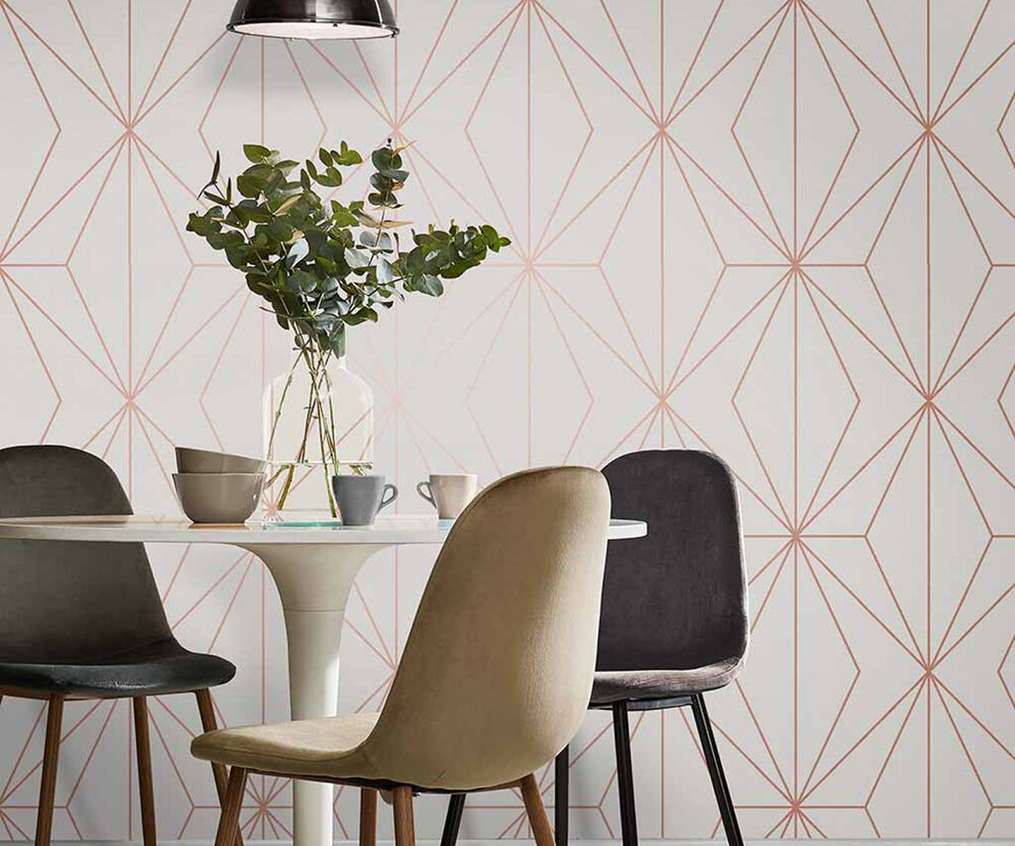
Scale also includes the visual weight of a pattern. A bold geometric with crisp contrast can read larger than its actual measurements. A soft watercolor botanical may feel more open and forgiving, even when its leaves are oversized. Likewise, a textured grasscloth or fine stripe can behave like a neutral because the overall effect is subtle from across the room.
Before choosing, look at a sample from several distances. Hold it at arm's length, then step across the room. What you see from the doorway matters as much as what you see up close.
How to Select Wallpaper Scale by Room Size
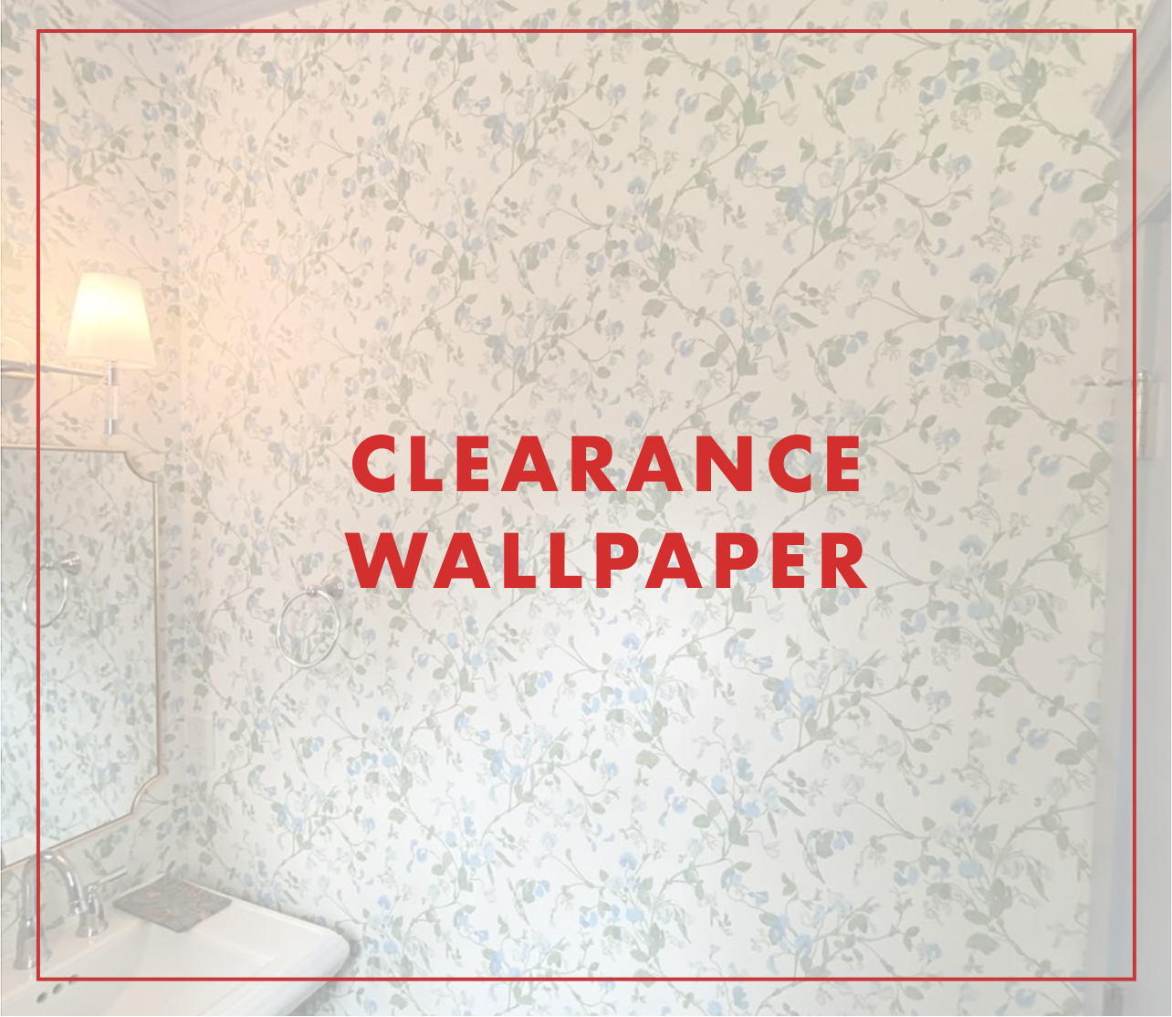
Small rooms do not automatically require small patterns, and large rooms do not always need oversized prints. That old rule is too limiting. A powder room, for example, is one of the best places to use a dramatic large-scale mural, oversized palm, or richly colored floral. Because the room is small, you take in the entire design quickly, and the wallpaper creates an intentional jewel-box effect.
The trade-off is visual energy. If a compact room already has a busy tile floor, ornate vanity, patterned shower curtain, or several open shelves, a high-contrast oversized print may feel crowded. Choose a simpler large-scale design with more background space, or select a small print in a quieter color palette.
In a spacious living room or primary bedroom, medium and large patterns often have room to breathe. Oversized botanicals, wide plaids, scenic papers, and broad geometric forms can give large expanses of wall a stronger point of view. A tiny all-over print may disappear unless the room has a more traditional, layered look and plenty of details to support it.
For average-size bedrooms, dining rooms, and entryways, medium scale is a reliable starting point. It offers visible pattern from a few feet away without taking over the room. Still, room size is only one part of the decision. A small room with tall ceilings can support more drama than a larger room with low ceilings and limited daylight.
Let Ceiling Height and Wall Shape Guide You
Ceiling height changes how wallpaper is perceived. In rooms with standard eight-foot ceilings, a very large vertical repeat can feel compressed if only part of the design is visible above furniture. A pattern with a smaller repeat, a horizontal spread, or a softer all-over layout may feel more proportional.
Tall ceilings create a natural opportunity for larger repeats. Long stems, vertical stripes, oversized arches, and scenic designs can emphasize height in a way that feels elegant rather than overwhelming. If you want to make a room feel cozier, use a pattern with horizontal movement or fuller motifs that visually bring the walls inward.
Consider the usable wall area, too. A living room wall broken up by windows, built-ins, doors, and a fireplace may not show enough of a grand mural for its full effect. That does not rule out a large-scale pattern, but choose one that looks good in fragments. A repeat with individual flowers, birds, or abstract shapes is usually more forgiving than a scene that needs an uninterrupted wall to make sense.
Match the Pattern to the Room's Job
The amount of time you spend in a space should influence your wallpaper choice. A lively, high-contrast print can be a welcome burst of personality in a foyer, laundry room, or powder room. These are spaces where a bold moment feels memorable without becoming tiring.
In a bedroom, nursery, home office, or family room, think about the atmosphere you want to live with daily. A larger pattern in tonal colors can feel restful because the contrast is low. A small-scale design can also work beautifully, particularly in classic bedrooms or spaces with upholstered furniture, but it may create a more decorative, layered effect.
Dining rooms offer more freedom. Since the room is often used for entertaining rather than all-day activity, a saturated floral, formal damask, or graphic geometric can bring a sense of occasion. When the table is set and the lighting is low, wallpaper adds depth that paint rarely delivers.
Balance Wallpaper With Furniture and Fabric
Wallpaper does not need to compete with every object in the room. If you have a substantial sectional, a large upholstered bed, or heavy wood furniture, a medium or large wallpaper pattern can hold its own and keep the walls from fading into the background. If your furnishings are delicate, streamlined, or visually spare, a bold print can become the room's main design statement.
Pay particular attention to other patterns. A room can mix wallpaper, rugs, drapery, pillows, and upholstery successfully when their scales vary. Pair a large floral wallpaper with a smaller stripe or textured solid fabric. Use a small geometric wallcovering behind a sofa with larger-scale pillows. When every surface carries similarly sized, high-contrast motifs, the room can lose its focal point.
Color plays a role here. A large-scale pattern in soft neutrals may be easier to combine than a small pattern in sharp black and white. If you love a bold print but worry it is too much, coordinate the rest of the room with quieter solids and natural textures.
Consider Light, Contrast, and Viewing Distance
Natural light tends to reveal more detail, while dim rooms can soften fine patterns until they read almost solid. In a darker hallway or interior powder room, a small, low-contrast design may not make much impact. A bolder color, metallic accent, tactile grasscloth, or pattern with clear definition can give the walls more presence.
Conversely, a sun-filled room can handle detail well, but it may also intensify strong contrast. Test a sample on the intended wall and check it in morning, afternoon, and evening light. The same navy-and-cream botanical can look crisp and tailored in daylight, then moody and enveloping after sunset.
Viewing distance matters most in larger rooms. A pattern that feels busy from six inches away may look beautifully composed from across a living room. In a narrow hallway, however, you will always be close to the wall, so a print's fine details and texture become more noticeable.
Order a Sample Before You Commit
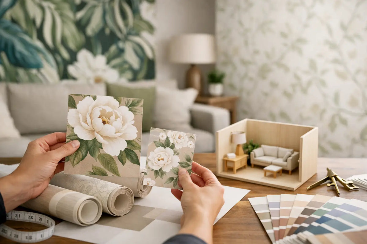
A digital image is an excellent starting point, but it cannot show true scale, texture, sheen, or color variation. Order a sample, or visit a showroom to see patterns alongside other materials in your project. At Wallpaper and Stuff, a broad in-stock selection makes it easier to compare styles, from subtle textures and timeless stripes to vibrant botanicals and statement geometrics.
Tape the sample at eye level on the actual wall. If possible, request enough material to see a full repeat rather than judging one cropped portion of the print. Place it near cabinet finishes, flooring, window treatments, and upholstery. Then photograph it from the room's entrance. A phone photo often reveals whether the wallpaper feels balanced at the distance where guests will first see it.
Also review the pattern repeat before ordering. A larger repeat can create more cutting waste, especially around windows and doors, so you may need additional wallpaper beyond the wall's square footage. That extra planning is worthwhile for a design you truly love.
The most successful wallpaper choices feel deliberate, not cautious. Let the room's architecture provide the framework, then choose a scale that supports the way you want the space to feel. A well-placed pattern can make a modest powder room unforgettable, give an open living area definition, or turn an ordinary bedroom into a place you look forward to coming home to.