Celebrating 35+ Years

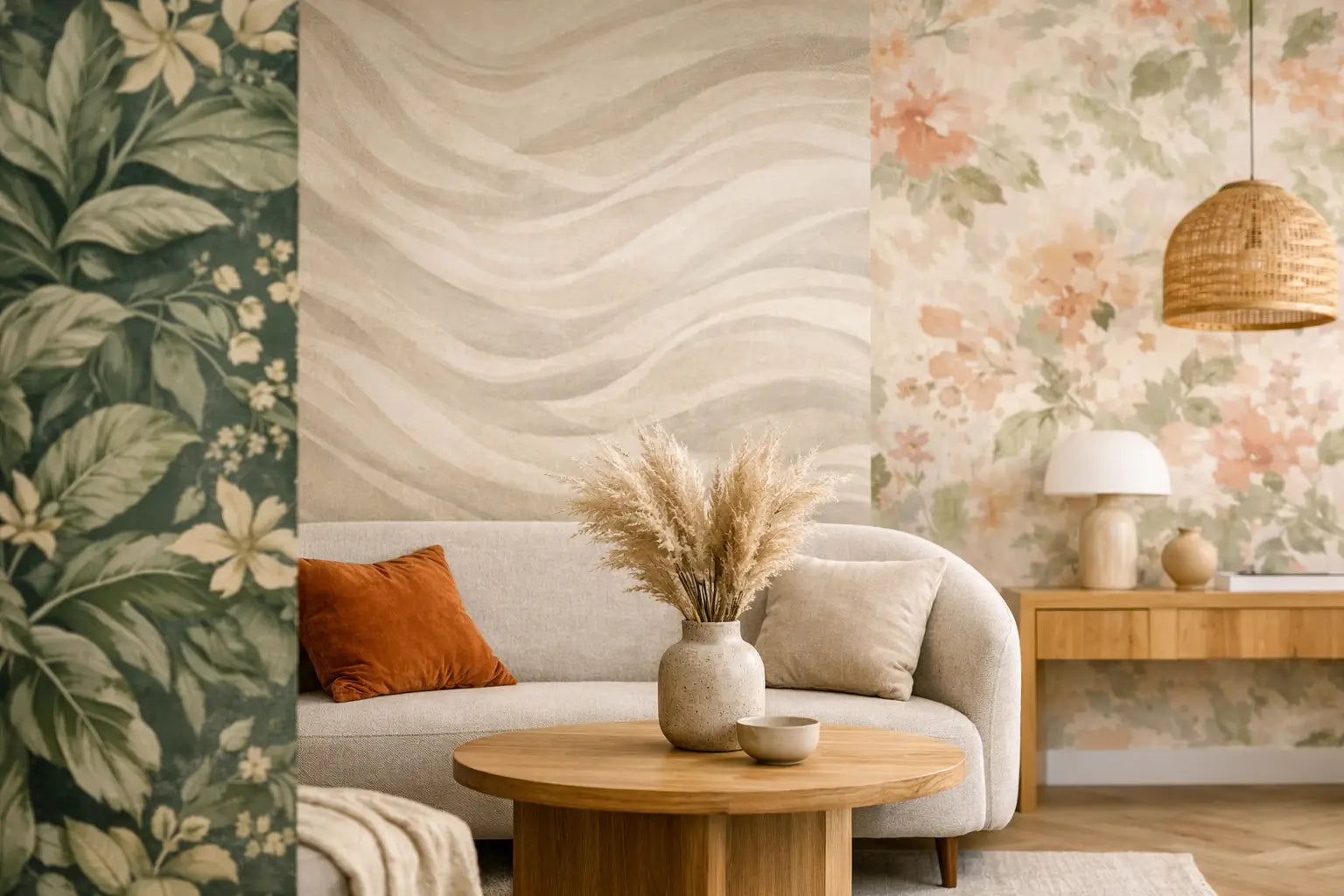
Wallpaper Color Trends for Homes to Try Now
A new wallpaper color can do more than freshen a room. It can make a compact powder room feel jewel-box special, bring calm to a busy bedroom, or give a dining room the sense of occasion that paint alone rarely delivers. The most appealing wallpaper color trends for homes right now are not about chasing a single must-have shade. They are about choosing color with depth, warmth, and a clear relationship to how you want a room to feel.
Homeowners are moving away from flat, one-note palettes and toward wallcoverings that create atmosphere. Think softened earthy hues, sophisticated blues, sun-washed pastels, and darker colors used with confidence. The right choice depends on your natural light, furnishings, room size, and how long you want to live with the look.
Wallpaper Color Trends for Homes: Warm, Layered, Livable
The strongest color direction is warmth, but not the bright beige of years past. Today’s warm neutrals have a grounded quality: mushroom, putty, oat, camel, clay, and soft taupe. These colors work especially well in living rooms, halls, and bedrooms because they bring visual comfort without making a space feel overly styled.
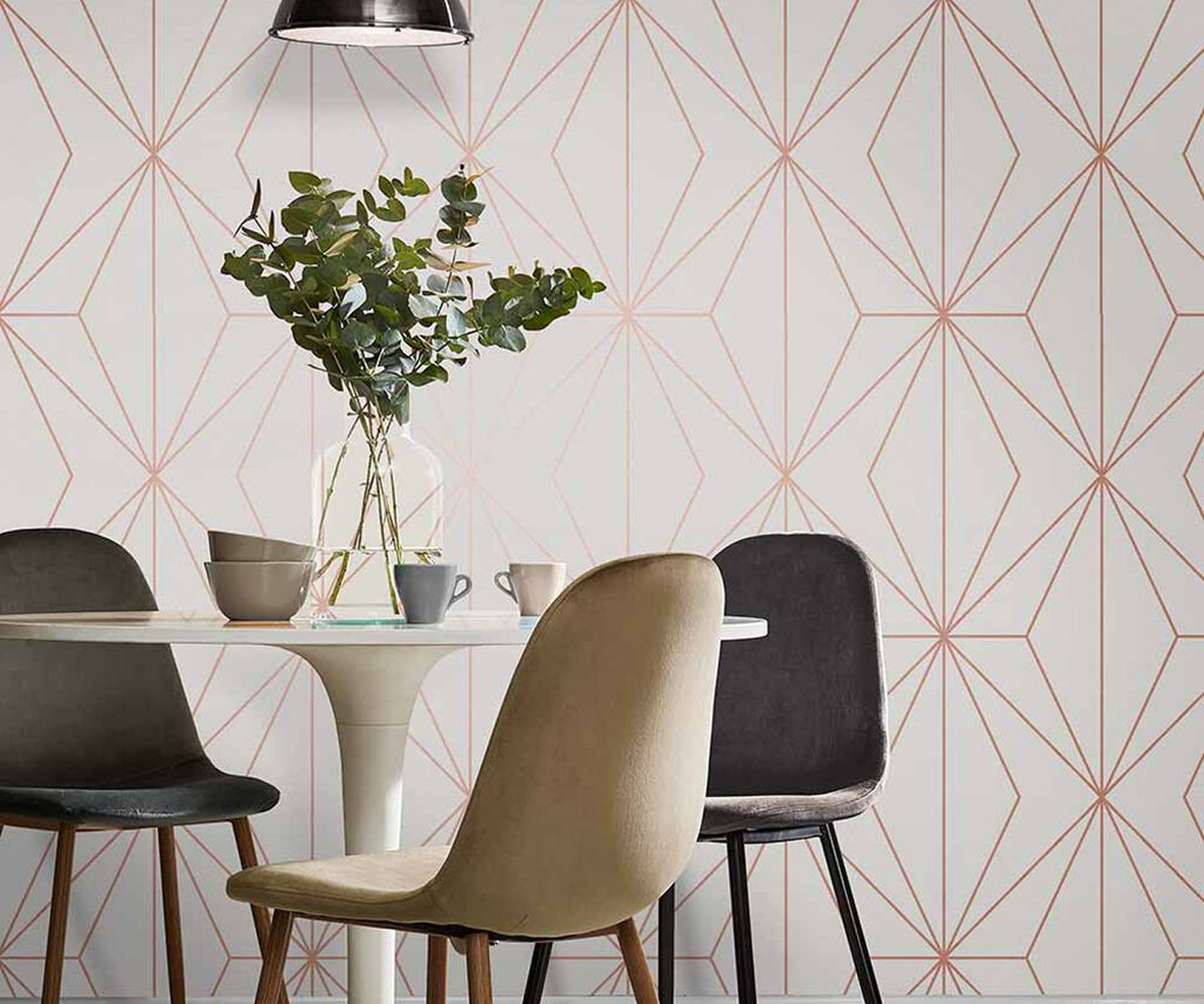
A warm neutral wallpaper becomes more interesting when the pattern adds movement. A tonal botanical, linen-like texture, small geometric, or softly printed stripe can give the wall dimension while keeping the overall palette calm. This is a practical choice for open-concept homes, where one wallcovering may need to sit comfortably alongside several furniture finishes and adjoining rooms.
Warm neutrals are not automatically safe, though. A pattern with too little contrast can disappear in low light, while a very busy print may compete with a room already full of texture. Requesting a sample and viewing it on the intended wall during morning, afternoon, and evening is the easiest way to avoid a costly surprise.
Earth Tones Move Beyond Rustic
Terracotta, cinnamon, olive, ochre, mineral brown, and deep sand are showing up in more polished ways. Rather than reading as rustic, these colors often appear in refined florals, block prints, abstract motifs, and textured grasscloth-inspired designs. They pair naturally with walnut, aged brass, creamy upholstery, black accents, and stone surfaces.
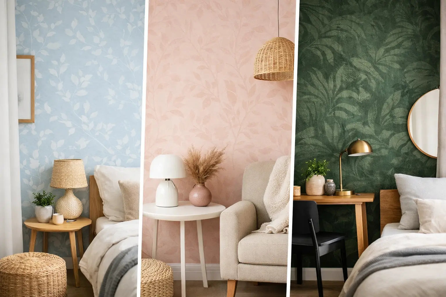
Muted green deserves special attention. Sage remains a favorite for its versatility, but moss, olive, and eucalyptus shades offer a richer alternative for libraries, dining rooms, entryways, and bedrooms. Green wallpaper can feel traditional or modern depending on the motif. A delicate vine print leans classic; a large-scale painterly leaf or graphic grid feels more current.
For homeowners who like earthy color but hesitate to cover four walls, a feature wall behind a bed or dining table is a strong starting point. It lets the color define the room without requiring every adjacent surface to coordinate.
Blue Is Becoming More Complex
Blue has lasting appeal, but the newest direction is less about bright coastal blue and more about nuanced, moody tones. Dusty denim, slate, ink, peacock, and blue-green shades bring depth while remaining easy to live with. They can make a bedroom feel restful and polished, or add quiet drama to a home office.
In rooms with generous daylight, a deep blue wallpaper can create a beautiful contrast with white trim, warm wood, and natural woven materials. In darker spaces, look for a blue pattern with a lighter ground, metallic detail, or a touch of cream to keep the walls from feeling heavy.
Blue is also an excellent bridge color for homes that mix styles. It works with traditional antiques, tailored upholstery, contemporary lighting, and casual natural fibers. That flexibility helps explain why it continues to appear across wallpaper collections season after season.
Soft Pastels Have Grown Up
Pastels are returning with more restraint. Instead of sugary pinks and icy mint, expect faded blush, pale apricot, misty lavender, butter yellow, and washed sky blue. These shades are especially effective in nurseries, guest rooms, and bathrooms, but they are not limited to youthful spaces.
The key is choosing a pattern with enough sophistication. A soft apricot floral on a warm ivory ground can feel inviting in a breakfast room. A pale lavender chinoiserie or delicate geometric can bring elegance to a guest bedroom. Even butter yellow, once difficult to place, feels fresh when balanced with natural wood, soft white trim, and a charcoal or espresso accent.
Pastels are most successful when they are treated as part of a layered palette rather than the room’s only source of color. Add contrast through furniture, window treatments, art, or hardware so the space has definition.
Dark Wallpaper Is a Design Decision, Not a Risk
Deep colors continue to earn their place in residential interiors. Charcoal, chocolate, forest green, aubergine, black, and navy wallpapers give rooms a sense of intention, particularly in spaces used later in the day. A dramatic powder room, den, dining room, or entry can often handle more color than homeowners expect.
The common concern is that dark wallpaper will make a room look smaller. It can make the boundaries feel closer, but that is not always a drawback. In a powder room or study, that enveloping effect can feel rich and memorable. The difference comes down to lighting and finish. A dark vinyl or non-woven wallpaper with a subtle sheen reflects more light than a flat, heavily matte surface. Metallic accents, lighter ceilings, and warm sconces can also keep the room from feeling closed in.
For a more forgiving approach, choose a dark-ground wallpaper with a medium or light pattern. The contrast gives the eye places to rest and can make the design feel more animated than a solid dark wall.
Texture Changes How Color Reads
Color is only part of the story. Material and finish can shift a shade dramatically, which is why wallpaper is so effective for creating a considered interior. A beige grasscloth may look golden in afternoon sun. A charcoal flock can appear almost velvety. Cork, beaded, and embossed wallcoverings bring highlights and shadows that change as you move through the room.
This makes textured wallpapers especially useful when a homeowner wants color without a large, obvious print. A woven neutral or tonal cork wallcovering adds visual interest to a formal dining room, primary bedroom, or office while allowing rugs, art, and furnishings to take the lead.
There are trade-offs. Natural materials may have visible variations and seams, which are part of their character but not right for every preference. In hard-working spaces, such as a family bath or mudroom-adjacent area, a durable vinyl may be the better choice. The most beautiful wallpaper is the one that suits both the room’s look and its daily use.
How to Choose a Trend That Will Still Feel Like You
Start with the room’s fixed elements. Flooring, countertops, cabinetry, tile, and large upholstered pieces should guide the wallpaper palette. A trend does not need to match every item exactly, but it should make the existing finishes look more intentional.
Then consider scale. Small rooms can carry large patterns and saturated colors beautifully because there is less wall area to overwhelm. Larger rooms often benefit from a pattern that has enough presence to be seen from across the space. If your furniture is patterned, a textured or tonal wallpaper may provide balance. If your furnishings are quiet, a colorful botanical or geometric can become the focal point.
Finally, trust the sample. Hold it beside paint, fabric, wood, and tile. Tape it to the wall rather than viewing it flat on a table. At Wallpaper and Stuff, the showroom experience and sample options make it easier to compare color, pattern, and texture before committing to a full room.
The best wallpaper color is not necessarily the one seen most often online. It is the shade that catches the light beautifully in your home, supports the way you live, and gives the room a finish that feels distinctly yours.