Celebrating 35+ Years


Best Wallpaper Colors for Small Rooms to Try
A small room does not need to be pale, plain, or forgotten. In fact, the best wallpaper colors for small rooms often create more personality than a larger space can carry. A well-chosen wallcovering can make a powder room feel polished, turn a compact bedroom into a retreat, or give a modest dining nook a finished, intentional look.
The key is not simply choosing the lightest color in the book. Color, pattern scale, sheen, natural light, and where the wallpaper stops all work together. Some rooms benefit from airy neutrals that visually recede. Others feel larger and more inviting when wrapped in a rich, moody hue. The right choice depends on the atmosphere you want to create.
Best Wallpaper Colors for Small Rooms
Soft white and warm ivory
White wallpaper remains a classic choice for tight hallways, small bedrooms, and rooms with limited daylight, but the undertone matters. A warm ivory, cream, or soft white is usually more forgiving than a stark, blue-based white. It reflects light while still feeling comfortable beside wood floors, brass fixtures, and natural textiles.
Look for a subtle woven texture, tonal botanical, or quiet geometric print rather than a flat solid. Texture gives a small room dimension without breaking up the walls visually. This is especially helpful where paint might feel a little unfinished.
Pale blue and misty green
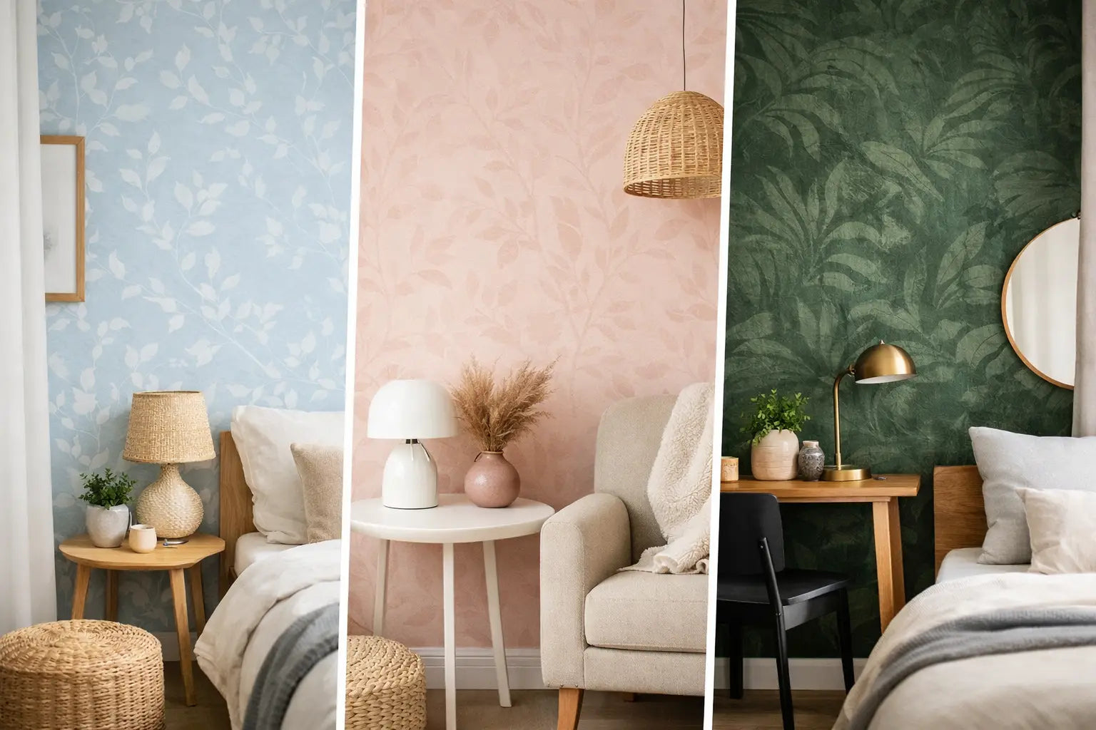
Soft blue and green wallpaper can create the sense of space people often want from a small room. Muted shades such as powder blue, pale eucalyptus, sea glass, and gray-green have a naturally calming quality. They work beautifully in bedrooms, bathrooms, and home offices where the goal is to make the room feel restful rather than busy.
For a room with one small window, choose a color with a gentle warmth beneath it, such as a softened sage rather than a sharp mint. Cooler shades can feel fresh in bright light, but they may read gray or chilly in a north-facing room. Always view a sample against the room's existing trim, tile, and furnishings before committing.
Blush, clay, and muted peach
Warm, dusty pinks have moved well beyond children's rooms. A restrained blush, terracotta-tinted neutral, or faded peach wallpaper brings warmth to compact spaces without closing them in. These shades are particularly flattering in powder rooms and dressing areas, where a little color can feel special.
The most versatile versions are grounded rather than sugary. Think faded rose with taupe, clay with cream, or peach softened by a linen-like texture. Pair them with white trim for a crisp look, or with warm wood and aged brass for a more collected interior.
Taupe, mushroom, and soft gray
Neutral wallpaper does not have to disappear. Mushroom, putty, stone, and warm gray offer an elegant backdrop when you want furnishings, artwork, or architectural details to lead. These colors make a small living room or guest bedroom feel considered while leaving plenty of flexibility for future changes.
Avoid assuming every gray will make a room look bigger. A cool gray can look sophisticated in a sun-filled space, but it may flatten a darker room. Taupe and greige generally provide more warmth and depth, especially with cream upholstery, oak, walnut, or woven accents.
Deep navy, forest, and charcoal
A dark wallpaper can be one of the most successful choices for a small room. It sounds counterintuitive, but deep colors soften the room's edges, making the boundaries feel less obvious. They also create a cozy, jewel-box effect that feels deliberate rather than cramped.
Navy, ink blue, forest green, charcoal, and deep teal are excellent options for powder rooms, libraries, bedrooms, and dining spaces. A dark floral, a tonal grasscloth look, or a small-scale geometric adds richness without requiring a large room to make an impact.
This approach works best when the room has enough contrast. White or light trim, a reflective mirror, warm metal lighting, or pale stone surfaces keep a saturated wallcovering from feeling heavy. In a windowless powder room, a darker wallpaper can be especially effective because it embraces the room's naturally intimate character instead of trying to fight it.
Light Matters More Than Square Footage
Before narrowing down wallpaper colors, pay attention to the light already in the room. A small south-facing room may handle a cooler blue, crisp white, or graphic black-and-white print with ease. A small north-facing room often benefits from warm cream, olive, tobacco, or rosy undertones that counteract the cooler daylight.
Artificial lighting changes the decision after sunset. Warm bulbs can make ivory wallpaper glow and can enrich earthy greens and browns. Cooler bulbs may make creamy papers look yellow and can pull unexpected blue tones from gray. Bring home samples and check them in the morning, afternoon, and evening. That simple step prevents many expensive surprises.
A wallpaper sample also lets you see how the color responds to the room's fixed finishes. In a bathroom, compare it with the vanity, countertop, floor, and tile. In a bedroom, place it near the headboard, drapery, and bedding. A color that looks perfect on its own may compete with a nearby material once it is on all four walls.
Pattern Can Change How a Small Room Feels
Color sets the mood, but pattern determines the movement. Small, delicate motifs and tone-on-tone designs are dependable choices when you want a room to feel open. They provide interest at close range while maintaining a calm overall impression.
That said, large-scale patterns are not off limits. A broad botanical, oversized chinoiserie-inspired floral, or expressive abstract can make a small room feel designed rather than undersized. The trade-off is visual energy. If the pattern is bold, let the rest of the room stay edited with simple window treatments, fewer accessories, and clear sightlines.
Vertical motifs can visually lift a low ceiling. Horizontal movement can make a narrow room appear wider, though it may also emphasize a low ceiling. Organic allover patterns are often the easiest choice because they disguise awkward corners and do not demand perfect symmetry around doors, windows, or vanities.
Choose the Right Finish for the Room
The material and finish affect how wallpaper color reads. A matte non-woven paper keeps colors soft and tailored, which suits bedrooms, dining rooms, and living areas. Vinyl wallcovering is a practical option for bathrooms, mudrooms, and other spaces where cleanability matters, and it is available in everything from subtle texture to statement-making prints.
Natural materials such as grasscloth and cork bring depth through tonal variation and texture. In a small room, that texture can feel beautifully layered, but it should be expected to have visible seams and natural color shifts. Those characteristics are part of the material's appeal, not flaws to hide.
Metallic accents can help a compact space feel brighter, particularly when used in a restrained pattern. A soft gold, silver, or pearlescent detail catches lamp light and adds dimension. Highly reflective finishes, however, can become busy when paired with a large, high-contrast print.
Consider Where the Wallpaper Belongs
Covering every wall creates a cohesive, immersive result and is often the strongest choice for a small powder room or bedroom. If full-room wallpaper feels like too much, an accent wall behind a bed, desk, or banquette can introduce color without taking over the entire space.
Do not overlook the ceiling. A pale blue, soft botanical, or tonal neutral paper overhead can add charm to a small room while leaving the walls quiet. In a room with good ceiling height, a deeper ceiling paper can make the space feel more intimate and architectural.
For homeowners who want to compare colors, patterns, and finishes in person, Wallpaper and Stuff offers a broad in-stock selection and a showroom setting where samples can be viewed alongside the materials that make a room feel complete.
The most successful small rooms rarely play it safe just because of their dimensions. Choose wallpaper color based on the feeling you want each time you enter: light and airy, warm and welcoming, or dark and dramatic. When the color suits the room's light and the pattern suits its purpose, even the smallest space can become the one everyone remembers.