Celebrating 35+ Years


How to Match Wallpaper Colors in Any Room
A wallpaper sample can look perfectly right in your hand, then feel surprisingly different once it meets your sofa, flooring, and daylight. Learning how to match wallpaper colors is less about finding an exact color match and more about building a room where each finish supports the next. The best rooms have contrast, repetition, and enough breathing room for the wallpaper to do what it does best: transform the space.
Whether you are refreshing a powder room, creating a dramatic dining room, or choosing a softer print for a bedroom, begin with the elements you are least likely to change. Then let wallpaper bring those colors together with pattern, texture, and personality.
Start With What Is Staying
Before choosing wallpaper, identify the room’s fixed features. Floors, countertops, tile, cabinetry, upholstery, and large area rugs usually have more influence on a color scheme than a throw pillow or piece of art. These are your anchors.
Look closely at their undertones. A gray sofa may lean cool and blue, warm and taupe, or slightly green. White cabinetry can be crisp, creamy, or softly gray. Even natural wood has a color direction: golden oak, red-toned cherry, weathered brown, or nearly black walnut. Wallpaper that echoes these undertones will feel connected to the room, even if its main color is different.
For example, a wallpaper with dusty blue leaves and a warm ivory ground can work beautifully with a camel leather chair and medium wood floors. The blue provides contrast, while the ivory and warm undertones keep the scheme from feeling split into separate pieces.
If you are decorating from an empty room, start with the wallpaper only after you have selected a general direction for the larger furnishings. Wallpaper offers so many possibilities that it is easier to narrow the search when you know whether the room needs to support a navy sectional, a warm oak dining table, or a serene upholstered bed.
How to Match Wallpaper Colors Using the Pattern
A patterned wallpaper does not need to contain every color in the room. In fact, trying to match every shade can make a space look overly coordinated. Instead, choose two or three colors from the paper to repeat elsewhere.
The dominant wallpaper color should guide the room’s overall mood. A deep green ground feels enveloping and refined, while a pale blue ground reads airy and relaxed. Pull a secondary color from the pattern for curtains, bedding, accent chairs, or a rug. Then use the smallest, most unexpected color in a more restrained way, such as on a lamp base, piping, artwork, or a single decorative accessory.
A botanical wallpaper with green foliage, soft coral blooms, and a tan background offers an easy formula: use tan or cream for the largest furnishings, green in textiles or painted trim, and coral in small accents. This approach gives the pattern a presence without asking the room to compete with it.
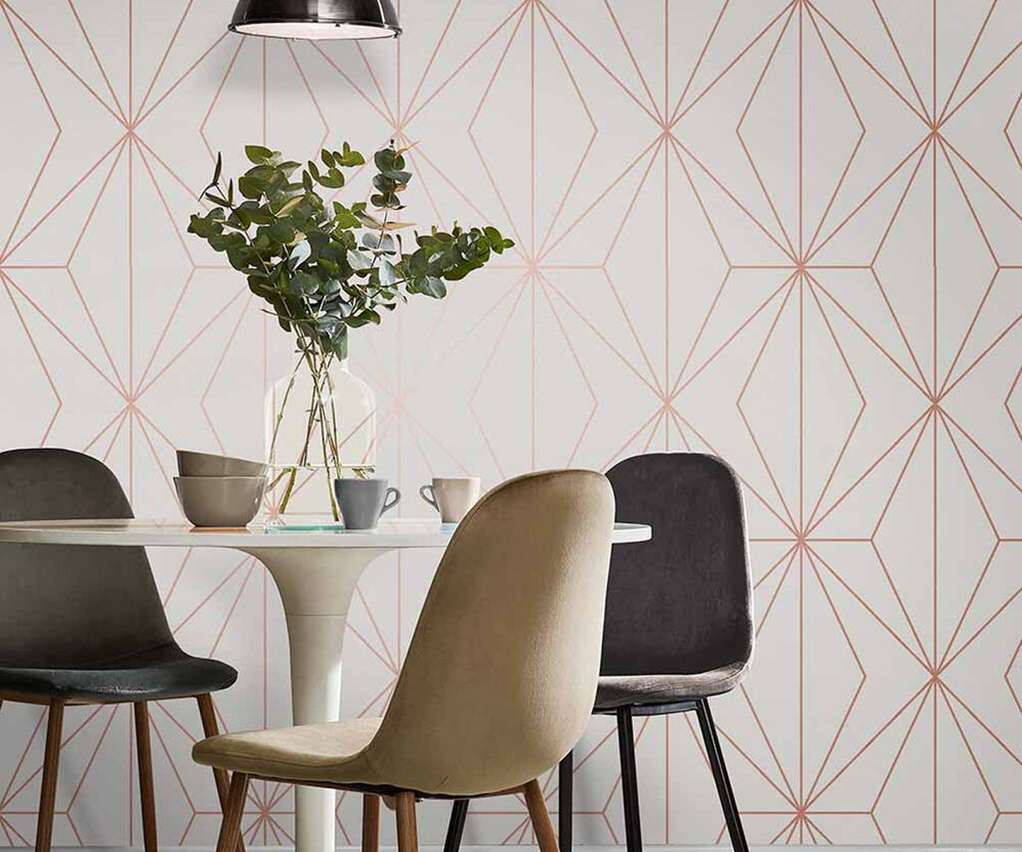
With a geometric print, let the scale of the design influence the rest of the room. Large, high-contrast geometry often looks best with quieter upholstery and solid window treatments. A smaller tonal geometric can support more texture, such as a woven rug, velvet chair, or grasscloth-inspired accessories. Pattern mixing can be beautiful, but it needs a shared color story and a clear difference in scale.
Match the Mood, Not Just the Swatch
Color matching is also about the feeling you want when you walk into the room. Two colors may technically coordinate yet create the wrong atmosphere together. Consider how the wallpaper’s temperature, depth, and intensity fit the purpose of the space.
Cool blue, green, and lavender wallpapers tend to create a calm, retreat-like effect in bedrooms and bathrooms. Warm terracotta, ochre, blush, and caramel can make dining rooms, entryways, and living spaces feel more inviting. Deep navy, charcoal, plum, and forest green add drama, especially in rooms used primarily in the evening.
It depends, of course, on the light. A moody wallpaper can feel elegant in a bright room with substantial windows, but it may feel heavy in a small, dim space unless you balance it with light trim, mirrors, and warm lighting. Conversely, a very pale wallpaper can disappear in a sunny room if it lacks enough pattern or texture.
For rooms with limited natural light, do not assume you must choose white or beige. A richly colored wallpaper can make a small room feel purposeful and cocooning. The key is to carry one lighter shade from the paper into the ceiling, vanity, towels, or surrounding walls so the space still has visual lift.
Use Paint as the Supporting Color
Paint should frame wallpaper, not fight it. When selecting a paint color for the walls around a feature wall, adjacent rooms, trim, or ceiling, avoid relying only on the wallpaper’s most obvious shade. The background color or a subtle neutral within the pattern often creates a more polished transition.
If a wallpaper has a warm white background, choose a paint that shares that warmth rather than a stark, blue-white trim color. If the paper includes several shades of green, a muted gray-green may be more livable on neighboring walls than the deepest emerald in the print. Pulling a softer shade usually gives the wallpaper room to stand out.
In a fully wallpapered room, white trim remains classic, but it is not the only option. Matching trim to the wallpaper’s background creates a tailored, continuous look. Choosing a darker color from the pattern for wainscoting, doors, or built-ins can add depth and make the design feel custom. Test this idea carefully in rooms with low ceilings or limited light, where a dark lower wall may need a lighter upper balance.
See Samples in the Room Before You Commit
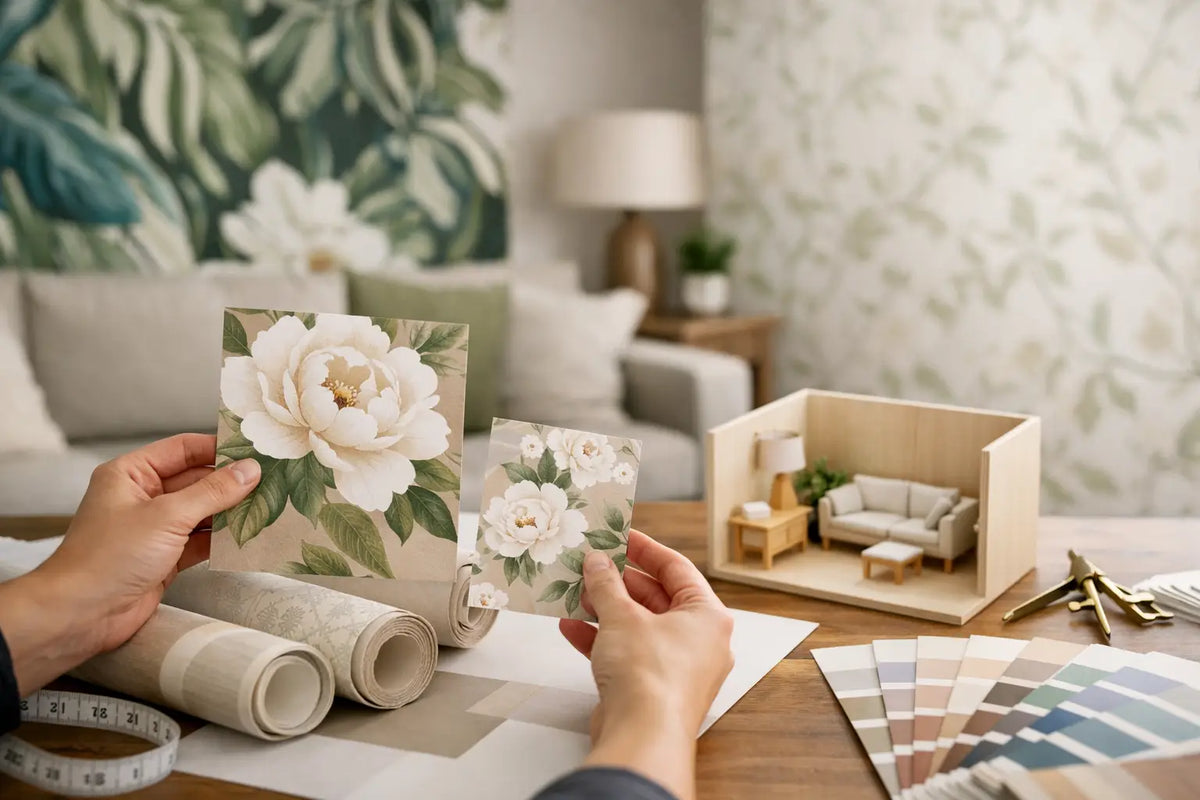
Light changes color more than most shoppers expect. A wallpaper that looks warm and creamy under showroom lighting can appear cooler beside a north-facing window, while a peachy neutral can become much more golden in late-afternoon sun. This is why samples are not a small detail. They are part of the selection process.
Bring the sample into the actual room and hold it beside your floor, upholstery, cabinetry, and paint. Look at it in morning light, midday light, and after the lamps are on. Tape it vertically to the wall rather than laying it flat on a table, since wallpaper is viewed on a vertical surface.
If you are considering several choices, compare them one at a time against the room’s main elements. Too many samples arranged together can make every option harder to read. Notice which paper makes the existing finishes look richer and more intentional. That is usually a stronger signal than whether it matches a single pillow exactly.
For Atlanta-area shoppers, seeing full-scale patterns and textures in person can make this decision much easier. Wallpaper and Stuff’s Smyrna showroom and sample options offer a practical way to compare color, scale, and finish before a roll is ordered.
Balance Color With Texture and Finish
Wallpaper material affects how color is perceived. A smooth non-woven or vinyl paper typically shows color more cleanly and evenly. Grasscloth, cork, flock, and beaded finishes add dimension that shifts with the light, often making a color feel deeper or more layered from different angles.
This matters when matching wallpaper to existing materials. A flat, contemporary navy print may pair naturally with lacquered furniture and clean-lined metals. A textured neutral grasscloth may feel more at home with linen upholstery, wood furniture, woven shades, and organic ceramics. Neither is better, but the finishes should speak the same design language.
If the room already has many tactile elements, such as a heavily veined stone countertop, patterned rug, and woven furniture, a simpler wallpaper can provide color without visual clutter. If the furnishings are streamlined and quiet, texture on the walls can supply the depth the room is missing.
A Reliable Color Formula for Any Room
When you need a clear starting point, use a three-part balance: one dominant color, one supporting color, and one accent. Wallpaper can supply all three, but they should not appear in equal amounts throughout the room.
Let the dominant color cover the largest visual areas, such as wallpaper, walls, a rug, or substantial upholstery. Repeat the supporting color in two or three places to create connection. Reserve the accent for smaller details. In a navy-and-cream wallpapered dining room, for instance, cream may appear in curtains and upholstery, navy may return on the walls or rug, and brass or rust can provide the small spark of contrast.
Neutrals count as colors in this formula. Ivory, mushroom, charcoal, black, and natural wood can be the element that makes a vibrant floral, tropical, or abstract wallpaper feel grounded rather than busy.
The right wallpaper does not have to match every item you own. It only needs to make the room’s best elements feel chosen, not accidental. Give yourself time with samples, trust the colors that repeat naturally, and choose the paper that still feels right when the light changes.