Celebrating 35+ Years

How to Choose Wallpaper by Room With Confidence
A dramatic floral can make a powder room feel like a jewel box. Put that same print on every wall of an open living room, however, and it may compete with the furniture, windows, and adjoining spaces. The difference is not simply personal taste. Learning how to choose wallpaper by room means balancing the mood you want with the room’s light, size, traffic, and everyday use.
Wallpaper gives a space more than color. It adds movement, texture, depth, and a point of view that paint alone rarely delivers. Start with the room’s purpose, then narrow your choices by pattern scale, material, and installation needs. This approach leaves room for creativity while helping you select a wallcovering you will enjoy living with.
How to Choose Wallpaper by Room: Start With the Feeling
Before comparing colors or patterns, decide what the room should feel like when you walk in. A bedroom may call for quiet softness, while a dining room can handle richer color and a more formal print. A busy entry benefits from a clear focal point, and a home office may need a pattern that feels energizing without becoming distracting on video calls.
Think about the elements that are staying: flooring, cabinetry, tile, upholstery, artwork, and window treatments. Wallpaper does not need to match every item, but it should give those pieces a common thread. Pull a secondary color from a rug, for example, or choose a warm ground color that complements wood furniture.
Light changes wallpaper more than many shoppers expect. North-facing rooms often read cooler and can benefit from warm creams, soft golds, terracottas, or warmer greens. Sunny south-facing rooms can carry cooler blues, grays, and crisp whites beautifully, although very bright light may make a high-contrast pattern feel stronger during the day. Always view a sample on the intended wall at different times before committing.
Living Rooms: Build a Backdrop or a Feature
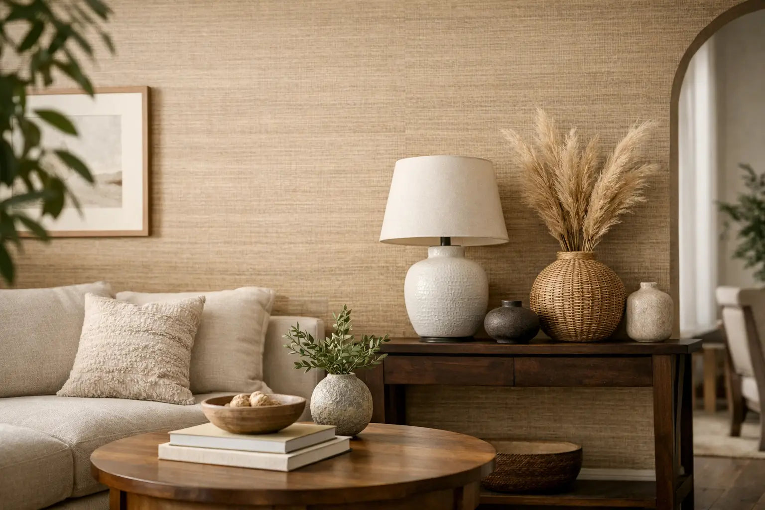
A living room wallpaper choice should work with the amount of visual activity already in the room. If you have patterned upholstery, colorful art, or a statement rug, consider a subtle grasscloth, linen-look non-woven, tonal geometric, or small-scale organic print. Texture can give the walls depth without asking for too much attention.
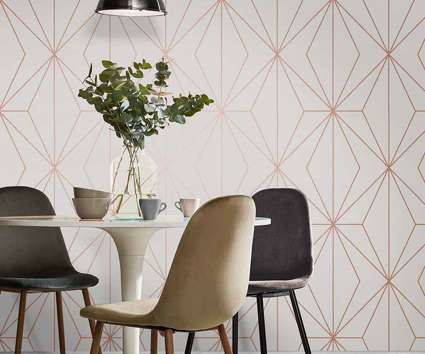
If the furnishings are streamlined or mostly neutral, wallpaper can become the defining layer. Botanical designs, oversized murals, and architectural geometrics are especially effective behind a sofa, on a fireplace wall, or in a seating nook. For a more traditional home, a refined stripe, damask, or botanical trail can create a collected, established look.
Large rooms generally have more freedom for larger-scale patterns, but scale is not only about square footage. Consider the wall itself. A wide, uninterrupted wall can showcase a broad repeat, while a wall broken by doors, windows, or built-ins may look better in a smaller, more forgiving print.
Dining Rooms: Make the Moment More Memorable
Dining rooms are made for a little drama. Because people spend limited, intentional time there, this is an ideal place for saturated color, metallic details, flocked patterns, or elegant traditional prints. A deep navy botanical, burnished gold geometric, or moody landscape can make even a simple dining set feel more considered.
Lighting matters here, too. Test samples near your chandelier or sconces, not just in daylight. A wallpaper with a slight sheen can look warm and inviting under dimmed lighting, while a high-gloss surface may create more reflection than you want. If the room is open to a kitchen or living area, carry over one color from the neighboring space to keep the transition easy.
Bedrooms: Choose Calm, Not Bland
Bedrooms benefit from wallpaper that supports rest while still feeling personal. Soft botanicals, watercolor motifs, muted plaids, delicate stripes, and textured neutrals all bring warmth without making the room feel overdesigned. For a primary bedroom, an upholstered headboard wall is a natural place to use a more expressive pattern, especially if the other walls stay quiet.
Children’s rooms and guest rooms can take a more playful approach. Whimsical animals, stars, checks, and cheerful florals add personality, but avoid choosing a trend solely because it feels current. A design that can grow with the room often offers better long-term value. Removable wallpaper can be useful in some situations, but its performance depends on wall preparation and the product itself. It is not automatically the best choice for every wall or every home.
Kitchens, Bathrooms, and Laundry Rooms: Let Material Lead
In hardworking spaces, the wallpaper material is as important as the design. Kitchens, bathrooms, mudrooms, and laundry rooms often benefit from durable, washable vinyl or vinyl-coated wallcoverings. These materials are practical around fingerprints, splashes, and frequent cleaning, particularly in spaces used by children, guests, or pets.
A powder room is different from a full bathroom. Without a shower filling the room with steam, a powder room is one of the best places to try grasscloth, cork, beadwork, metallic finishes, or a bold small-scale print. The room is compact, so even a distinctive design requires relatively little wallpaper while making a strong impression.
For full bathrooms, prioritize ventilation and follow the manufacturer’s installation guidance. Avoid placing delicate natural materials where they will receive repeated moisture or direct splashing. In kitchens, consider using wallpaper above the backsplash line or on a breakfast-area wall rather than directly behind a range or sink unless the installation area is properly protected.
Entries, Hallways, and Stairs: Use Pattern to Create Momentum
Transitional spaces are often overlooked, yet they are where wallpaper can make a home feel intentional from the first step inside. An entry can support a welcoming print that sets the color story for the rest of the house. Hallways are well suited to rhythmic patterns, vertical stripes, or small repeating motifs that add interest without making a narrow passage feel closed in.
Stairwells are a chance to think vertically. A rising botanical, elongated stripe, or scenic paper can emphasize the architecture and turn an ordinary route between floors into a design moment. Since these spaces can be difficult to measure and install, account for extra material and pattern repeat from the start.
Match Pattern Scale to the Room, Not a Rulebook
The old idea that small rooms require small patterns is too limiting. A large print in a small room can be spectacular because it reads as immersive rather than busy. Powder rooms, closets, and compact offices are often the right places to take that risk.
What matters is contrast and visual density. A large, open floral with plenty of background space may feel calmer than a tiny, tightly packed pattern. Likewise, a small geometric in sharp black and white may feel more energetic than a large tonal mural. Look at the entire sample from several feet away, then assess how the repeat will read across a full wall.
Order Samples and Plan for the Practical Details
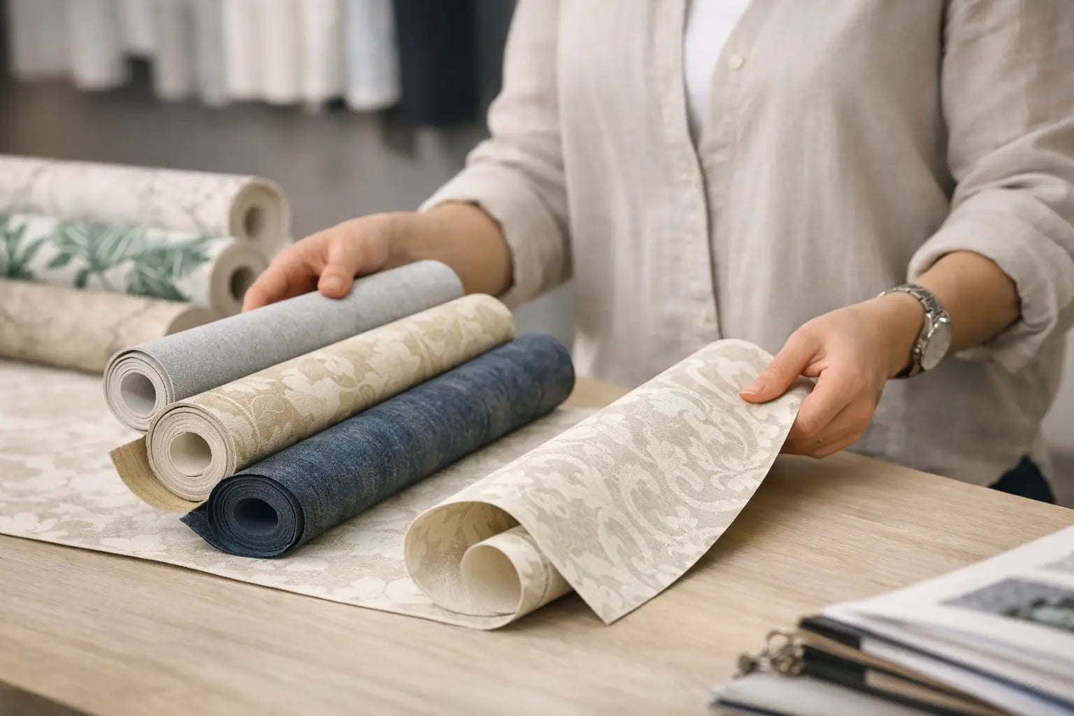
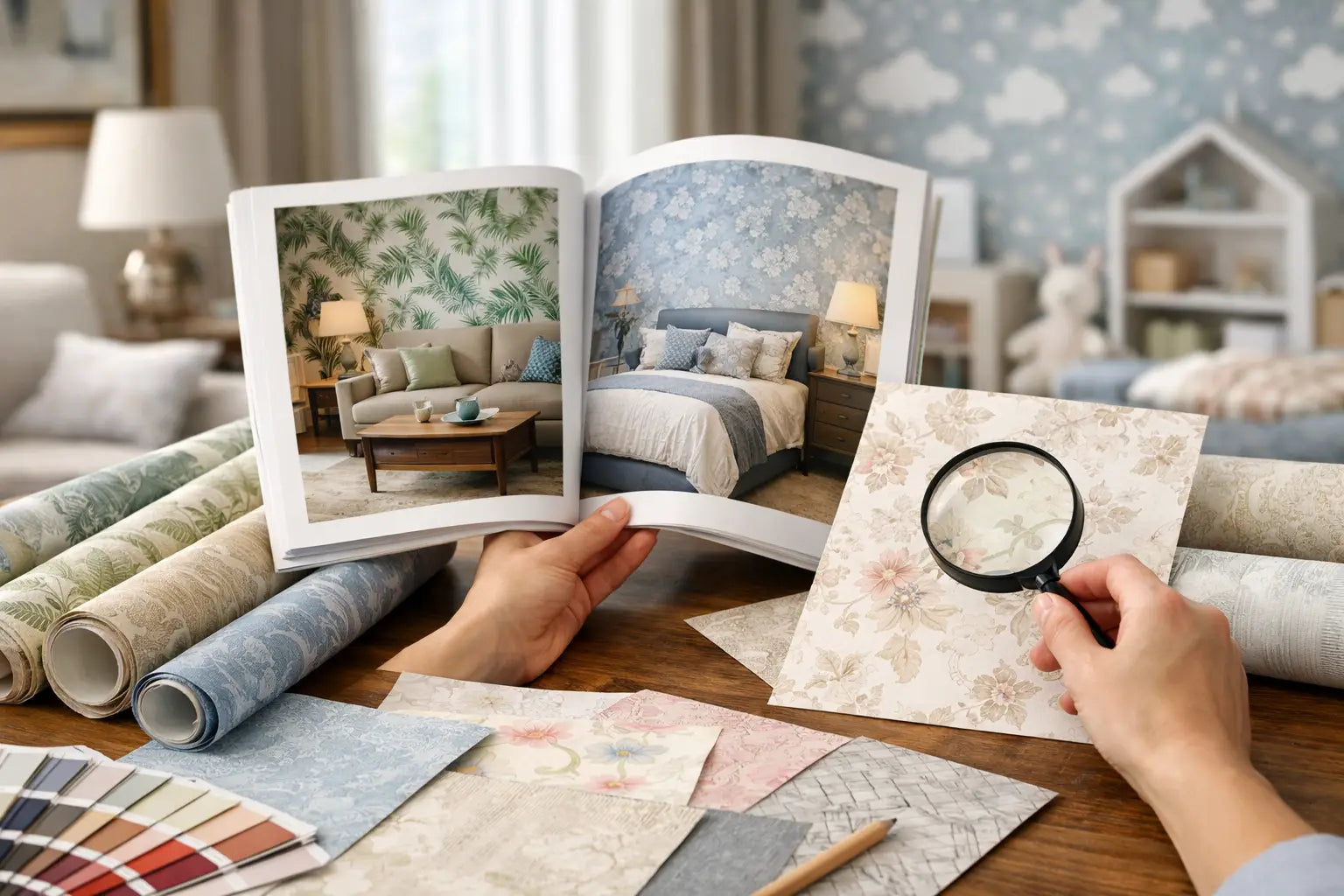
A screen cannot show the true texture of grasscloth, the scale of a repeat, or the way metallic ink catches light. Samples are the most useful step between inspiration and purchase. Tape them at eye level, next to trim and furnishings, and look at them morning, afternoon, and evening.
Measure each wall carefully, then account for pattern repeat, doors, windows, and installation cuts. Do not assume a room’s square footage equals the amount of wallpaper needed. A large repeat generally requires more material to align the pattern, and it is wise to order enough from the same dye lot for the full project.
For Atlanta-area shoppers, Wallpaper and Stuff offers the added confidence of seeing texture, color, and scale in person in its Smyrna showroom. Whether you shop in person or from home, choosing a sample before placing the full order is a small step that can prevent an expensive mismatch.
The best wallpaper is not necessarily the boldest print or the safest neutral. It is the one that suits the room’s real life, looks right in its natural light, and makes you pause at the doorway because the space finally feels like yours.