Celebrating 35+ Years

How to Choose Wallpaper Pattern at Home
A wallpaper sample can look perfect in your hand and completely different once it covers an entire wall. That is usually the moment homeowners start asking how to choose wallpaper pattern in a way that feels intentional instead of overwhelming. The right pattern does more than add color - it shapes the mood of the room, changes how large the space feels, and helps every furnishing around it look more considered.
Wallpaper is one of the fastest ways to transform a room, but pattern is where most decisions get stuck. Floral, geometric, stripe, botanical, abstract, damask, textured solid - each one brings a different energy. The best choice is rarely about what is trending on its own. It is about what suits your room, your light, and the way you want the space to feel every day.
How to choose wallpaper pattern by room purpose
Start with the job the room needs to do. A wallpaper pattern should support the experience of the space, not compete with it.
In a bedroom, softer movement usually feels more restful. That could mean a loose botanical, a delicate floral, or a subtle textured print with enough variation to keep the walls from feeling flat. In a dining room or powder room, you can often go bolder because people spend shorter, more intentional stretches of time there. Rich geometrics, moody florals, and high-contrast prints tend to shine in smaller statement spaces.
Living rooms sit somewhere in the middle. If the room is already active with art, patterned upholstery, or open shelving, a wallpaper with a quieter rhythm may bring balance. If the furniture is simple and the palette is restrained, a larger-scale pattern can become the focal point that makes the room feel finished.
There is no rule that says small rooms need timid wallpaper. In fact, compact spaces often handle dramatic pattern beautifully. What matters more is whether the pattern matches the atmosphere you want. Cozy and layered is different from bright and airy, and both can be successful.
Scale matters more than most people expect
When people wonder how to choose wallpaper pattern, scale is often the missing piece. A pattern can be beautiful and still feel wrong if its size does not relate well to the room.
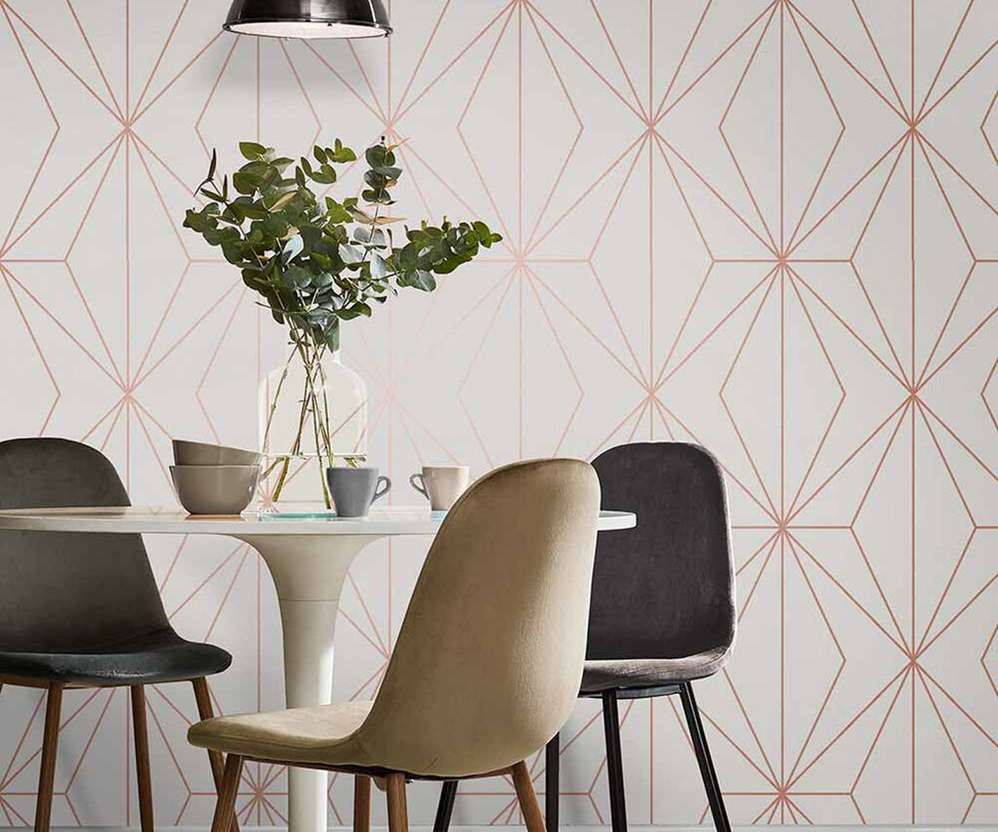
Large-scale patterns tend to feel bold, expressive, and decorative. They work especially well on feature walls, in dining rooms, behind beds, and in powder rooms where you want immediate impact. They can also make a room feel more current because oversized prints often read as more fashion-forward.
Small-scale patterns usually feel quieter and more traditional. They are useful when you want texture from a distance and detail up close. They can also be easier to live with in spaces where every wall will be papered, especially if the room has many doors, windows, or architectural interruptions.
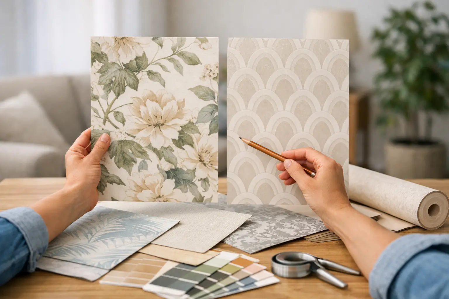
The trade-off is simple. Large patterns make a stronger statement but can dominate if the room is already busy. Smaller patterns are versatile but can disappear if you are hoping for a dramatic transformation. If you are unsure, sample both a small and a large print in the same color family. Scale is much easier to judge on the wall than in your imagination.
Color should connect the room, not just the wall
Pattern gets attention first, but color is what makes wallpaper feel integrated with the rest of the home.
Look at the fixed elements in the room before choosing a pattern. Flooring, countertops, tile, wood tones, window treatments, and large upholstery pieces all matter. A wallpaper does not need to match these elements exactly, but it should speak the same visual language. Warm neutrals pair best with patterns that carry creamy, taupe, gold, rust, or earthy green undertones. Cooler spaces usually feel more cohesive with crisp white, gray, blue, charcoal, or sage-based patterns.
Contrast is useful when done on purpose. A deep navy pattern can make white trim look sharp and architectural. A soft beige grasscloth-style print can calm a room with darker wood furniture. A green botanical can bridge natural wood, black accents, and ivory upholstery in one move.
If you love a pattern but worry about commitment, start with a color story you already know works in your home. That lowers the risk and makes the wallpaper feel like an extension of your style instead of a separate design decision.
Think about light before you commit
Wallpaper changes throughout the day. Natural light, lamp light, and overhead lighting all affect how a pattern reads.
Rooms with generous daylight usually show more color variation and detail. This is where layered patterns, subtle metallic accents, and dimensional textures can really come alive. Darker rooms need a little more caution. A moody pattern can feel sophisticated, but if the space lacks light, it may also feel heavier than expected.
Finish matters too. Matte papers often feel soft and refined. Vinyls can be practical and easier to wipe clean, especially in high-traffic areas, kitchens, and baths. Textural wallcoverings such as grasscloth, cork, or beaded styles add depth even when the color palette is restrained. They are ideal when you want visual richness without a busy print.
This is one reason samples are so valuable. Tape them up and check them in the morning, afternoon, and evening. What feels bright at noon may feel completely different after sunset.
Match the pattern to the architecture
A wallpaper pattern should work with the shape of the room, not ignore it.
Stripes can make ceilings feel taller and bring order to walls with traditional trim. Horizontal movement can visually widen a narrow room, though it can also emphasize a low ceiling if the stripe is too strong. Organic prints, such as botanicals and flowing abstracts, tend to soften boxy rooms and newer construction. Formal patterns like damasks or trellis designs often complement classic homes, dining rooms, and entryways where you want a more polished look.
Architectural details also affect how much pattern a room can handle. Wainscoting, built-ins, large windows, and paneled millwork naturally break up the wall surface. That can make a stronger wallpaper feel more manageable because less of it is visible at once. On large uninterrupted walls, the repeat becomes more noticeable, so scale and rhythm matter even more.
How to choose wallpaper pattern with existing furniture
Your wallpaper should not compete with every fabric and finish in the room. It should create a hierarchy.
If you already have a boldly patterned sofa, rug, or drapery, wallpaper often works best when it plays a supporting role. That does not mean plain. It means choosing a pattern with softer contrast, more open space, or a texture-forward look. If your furnishings are mostly solid, wallpaper can do more of the decorative lifting.
A helpful question is this: what do you want people to notice first? In some rooms, it is the dramatic wallpaper. In others, the wallpaper is there to frame a favorite headboard, art piece, or dining set. Once you know the focal point, the pattern choice becomes clearer.
Mixing patterns is possible, but they should vary in scale and style. A tight plaid rug and a large botanical wall can work. A busy medium-scale rug with a busy medium-scale wallpaper usually feels more accidental.
Use samples like a designer would
Shopping online opens up a wider range of styles, but wallpaper is still a tactile purchase. The smartest step is to narrow your choices, then live with samples before placing the full order.
Tape them on different walls, not just one. Stand at the doorway. Sit where you normally sit. Look at the sample next to trim, flooring, and upholstery. If possible, place it beside another option so you can compare not only what you like, but what truly works.
This is where a deep assortment helps. A retailer with strong in-stock options, specialty materials, and sample access gives you room to compare styles instead of settling too quickly. For Atlanta-area shoppers, visiting a showroom such as Wallpaper and Stuff can make that process even easier because pattern scale, texture, and color become much easier to judge in person.
The best choice usually feels clear after you narrow the field
If you are stuck between several patterns, do not ask which one is most impressive. Ask which one still feels right after the novelty wears off. A good wallpaper pattern has presence, but it also has staying power.
The strongest choices usually check three boxes. They suit the room’s purpose, they connect with the existing finishes, and they feel like a natural expression of your style rather than a trend you are trying to force. Once that balance is there, the room starts to come together quickly.
Wallpaper should make your home feel more like home. Choose the pattern that gives the room the feeling you want to walk into again and again.